The Content Card block is designed with 3 display styles. To maximize user customization, we have not set a quantity limit. Therefore, if the default layout of the Content Card is not aesthetically pleasing, you need to use the „Columns“ block in the design to constrain its display position and quantity.
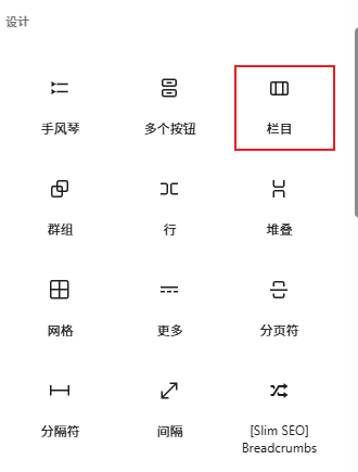
Create a column, click the plus icon to add the „Columns“ block, select the built-in „Columns“ layout, and then insert „Content Card“.
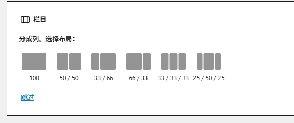
For example, if we choose 55 or 333 split, we can place 2 or 3 Content Cards.
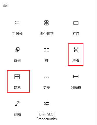
Alternatively, you can create a „Stack“ or „Grid“ layout.
Tip:
Click the icon in the top-left corner to view the blocks used on the page, making it easy to select and configure the corresponding block.
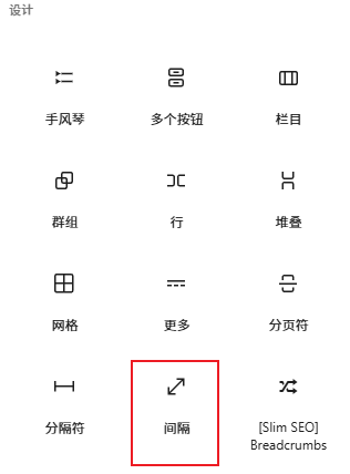
To add spacing between sections, use the „Spacer“ block.