When the old version of the LingHang theme was first developed, the official WordPress API v3 specification had not yet been implemented. As WordPress versions continue to iterate, the official team has gradually enforced the new API v3 standard and clearly stated that it will be fully adopted in subsequent versions. This means that currently functional old themes will not be compatible with the new WordPress core environment, leading to compatibility failures, functional anomalies, and other issues.
To adapt to the latest official WordPress technical specifications and ensure the long-term stable operation of the theme, we havecompletely restructured and upgraded the LingHang theme at the underlying level, fully compatible with the API v3 standard, thoroughly resolving compatibility issues with future versions.
In addition to the underlying technological innovation, the new version of the LingHang theme has also optimized and enriched customization features, greatly improving user experience and website performance: new custom header and footer styles with multiple layouts are added to meet the page layout needs of different enterprises; meanwhile, the old block system is abandoned and fully replaced with WordPress native block patterns, making operation simpler and adaptability stronger.
After optimization and upgrade, the theme's redundant resources are significantly reduced, page loading speed is faster, and operation is lighter, balancingease of use, aesthetics, and website speed. Below are all theme options and block pattern demos of the new LingHang theme.
Theme Options
More custom items have been added to meet user needs. If there are changes later, the actual version features shall prevail.
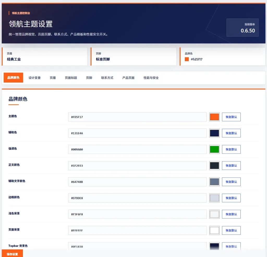
LingHang Theme Brand Color Settings
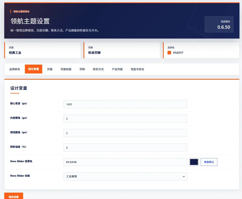
LingHang Theme Design Variable Settings
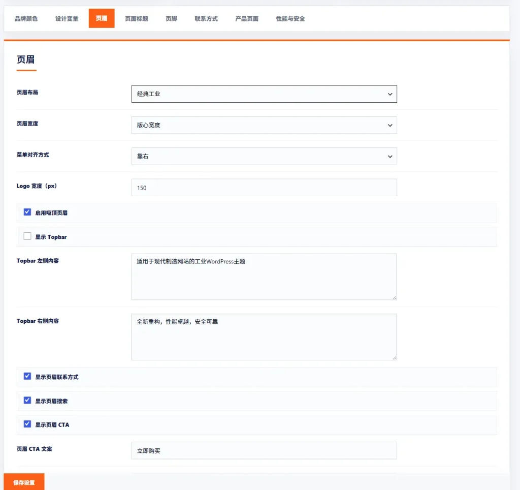
LingHang Theme Header Settings
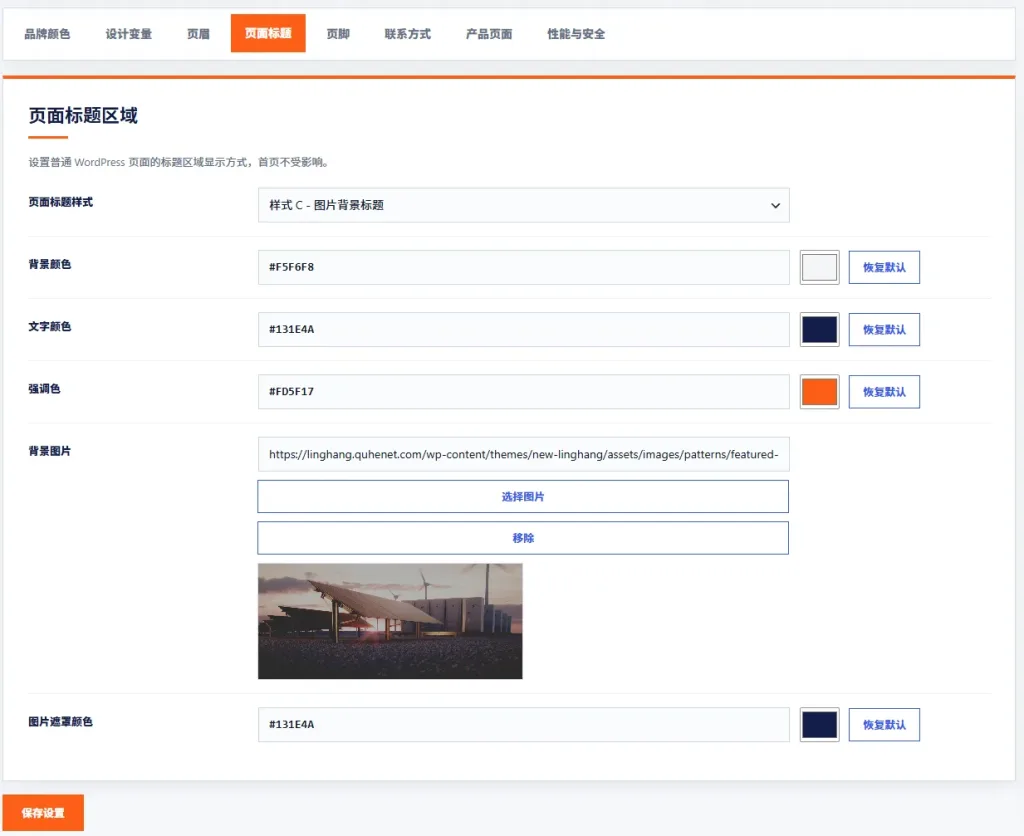
LingHang Theme Page Title Settings
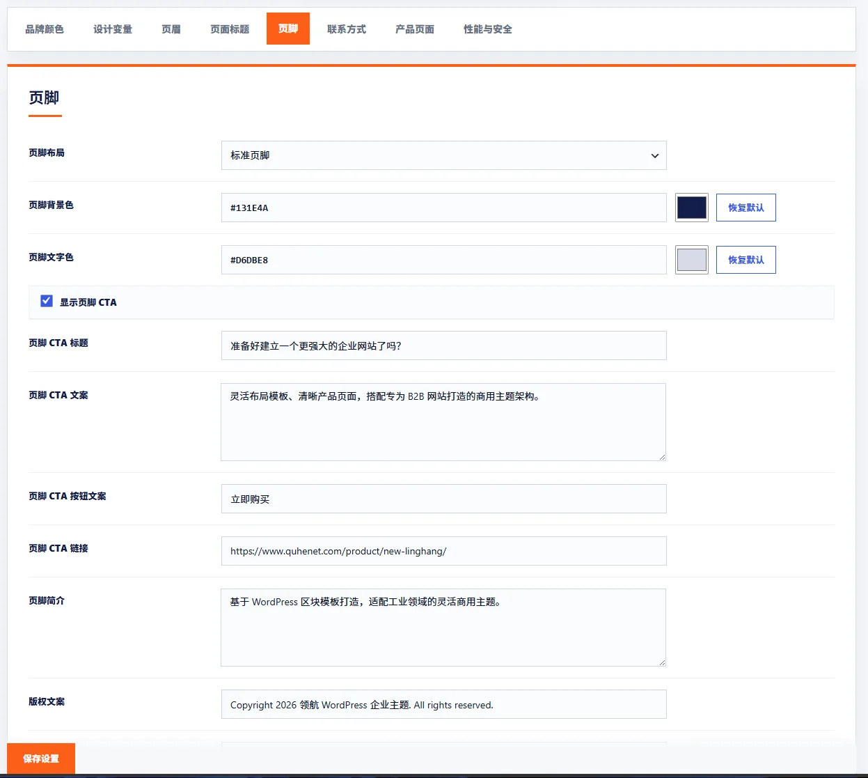
LingHang Theme Footer Settings
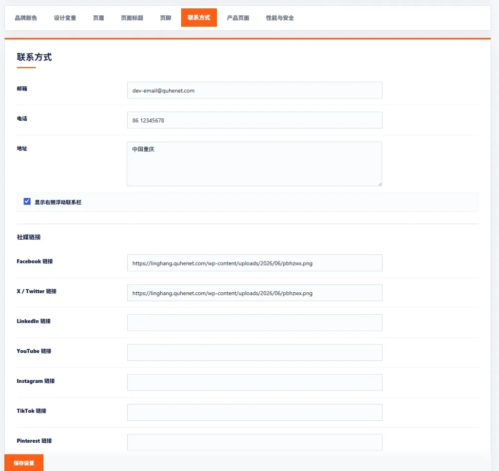
LingHang Theme Contact Information Settings
LingHang Theme Contact Information Settings
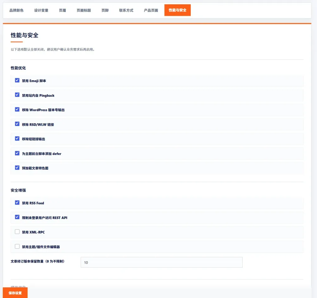
LingHang Theme Performance and Security Settings
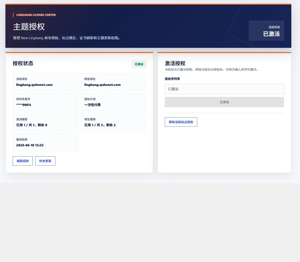
LingHang Theme Authorization Settings
Block Pattern Display
All block samples can be modified and customized after insertion. The number of samples will be updated periodically based on user needs.